The Development Process behind Dying Light 2's Environments and Buildings

Environment Art Director at Techland, Katarzyna Tarnacka, has told us about the process of designing levels in Dying Light 2 Stay Human, spoke about the game's art direction, and discussed the ways of guiding the player.
Intro
80.lv: When you think about Dying Light in general and you think about art direction, what are the first things that jump to mind, what did you have in mind when figuring out the style?
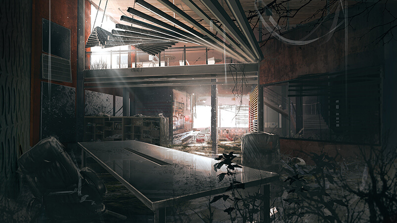
Katarzyna Tarnacka, Environment Art Director at Techland: We have different parts that we built every piece of the game on, and they relate to both art direction as well as game design, but the way I see it, the most important part is literally dying light, that is, the death of light, the moment when the day changes into the night. And so I always thought about that dying light and the world of the game through this perspective. There’s this duality of the world, the fact that the day is for humans, while the night belongs to the infected; but then we pushed and moved the idea forward, trying to find this division of the world in different areas, and that’s how we got the division of streets and rooftops. In Dying Light 2, the streets belong to the infected, people rarely roam there, and only the toughest people go there, they don’t build there. It’s not a safe habitat where you can live normally.
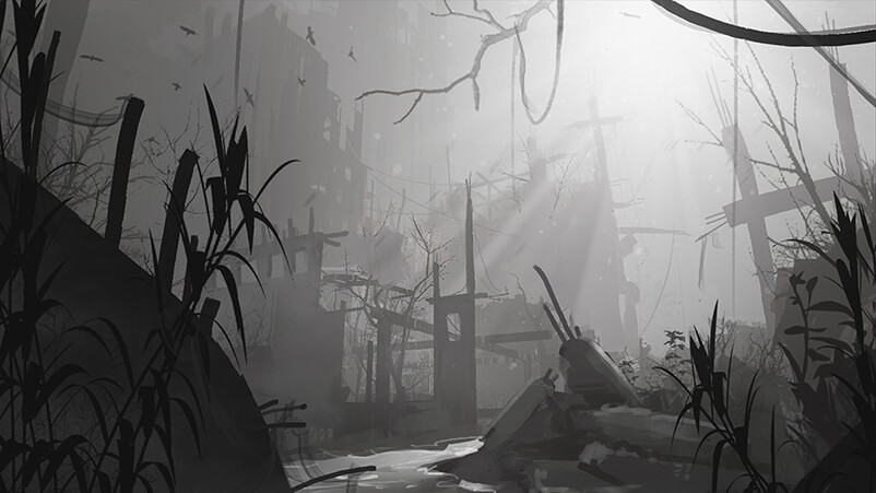
Their current level zero, the ground level, is on the rooftops, and this is where the humans live, this is where they build their structures, where they grow food, but it’s also where the vegetation’s moved to. The reason we decided to move the vegetation to the rooftops is we wanted to, again, emphasize the difference between life and death or light and darkness even further, and so we opted for a story that chemicals were dropped at some point and they’ve poisoned the groundwater, so the vegetation on the ground level is very scarce, rarely do you see live plants there, although they do flourish on the rooftops. To me, this is personally my favorite, the most important aspect of the game, as you can logically progress through every piece of art direction to reach this duality of light vs. darkness, and the death of light.
80.lv: I didn’t think of that, whenever the night falls, I skip to the day, I’m not brave enough to do otherwise.
Katarzyna Tarnacka: I do the same thing, and I actually like the fact that in the original Dying Light game, the night was just absolutely too scary for me, there were only two quests in the main story that forced you to play the night gameplay, and that was it for me. I spent, I don’t know, thousands of hours playing that game, I can traverse it with my eyes closed, and yet those two moments when you have to go outside at night were just too scary for me. And I love it, I wanted to put more emphasis on that.
Designing Buildings
80.lv: Can you talk a little bit about the process of designing parkour-appropriate buildings for Dying Light 2 from the point of view of sandbox games?
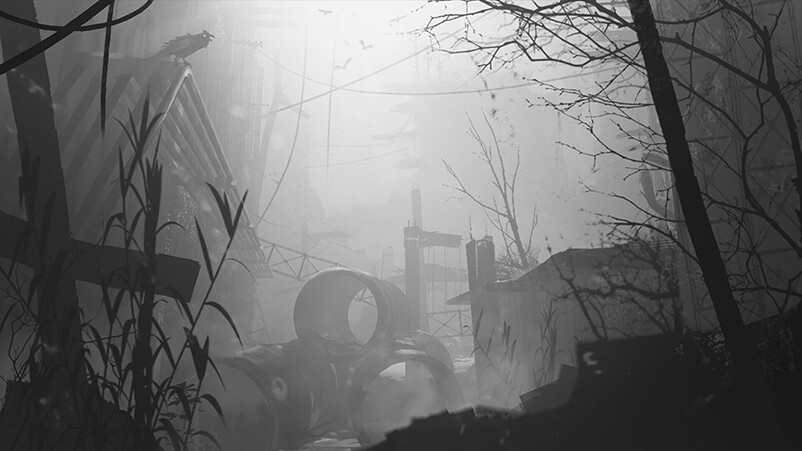
Katarzyna Tarnacka: It’s actually really difficult to design buildings the same way they are designed in Dying Light 2. I’m used to it, because I’ve worked on Dying Light as well, so it’s a lot of years of experience for me, but I see that when people from different gaming backgrounds join us, it’s difficult to switch your thinking into "not only is it an open world, not only is it the first-person perspective, but it’s also parkour".
So, we have no way of taking a shortcut and guide the player, there’s no introduction, you cannot introduce a player to the city, so we have to come up with different ways of guiding players. We tried, and hope we were successful in that, to build an entire city plan in a way that, for instance, at the end of the street, there’s always something that you see and through that, you know where you are in a relation to objects, such as monuments, interesting buildings, churches, and stuff like that. And then, there’s the placement of parkour helpers, which are all the assets that we use, all the objects and solutions that we utilize to help players find a parkour path. This is also something that we apply in order to help players find a way, whether it’s a way they are currently going because of a quest or whether it’s a way up or down depending on where they can go.
Level Design
80.lv: What is your approach to level design?
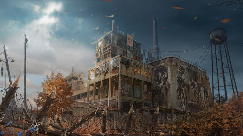
Katarzyna Tarnacka: We’ve been working on the map for many years. Even before the actual production of Dying Light 2 started, we had already been building prototypes and seeing what kind of gameplay we could have, because in the first one, there are basically two geometries that you interact with: the Slums region, which is very easy to create parkour in, and then there’s Old Town, which is a little bit more tricky, but also more interesting visually.
We tried a lot of different approaches, we even built an actual map on paper and had everybody on the team, including level artists, level designers, concept artists, and 3D artists, move pieces of paper that represented buildings around, trying to figure out how to meet all the requirements, since the needs from different departments are vastly different and very often contradictory, because level design needs things that usually don’t look like a city. Which is the toughest problem for us, but also very exciting to solve, at least for myself - how to create a city that serves the gameplay purposes but may also be contradictory to them and might not look like a city.
But what we tend to do is stick to a gameplay prototype that is often a bunch of gray boxes and unidentified objects, and then we have some references, concept artists come in and talk directly to level designers to find a way to modify the prototype in a way that it looks like a city, you know, the shapes of streets are natural and real, the buildings are correct sizes etc.
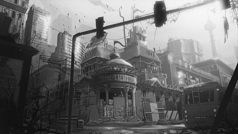
80.lv: You also have this little city within the city where survivors live, how was it created?
Katarzyna Tarnacka: In this game, you have two different approaches that are kind of opposites. What I mean by this is that, for instance, the Peacekeepers are kind of the opposite of the Survivors, so the approach to them is very different. We take both factions that we have, and we try to decide if these guys use yellow, so then those other ones should use blue, because they’re opposites.
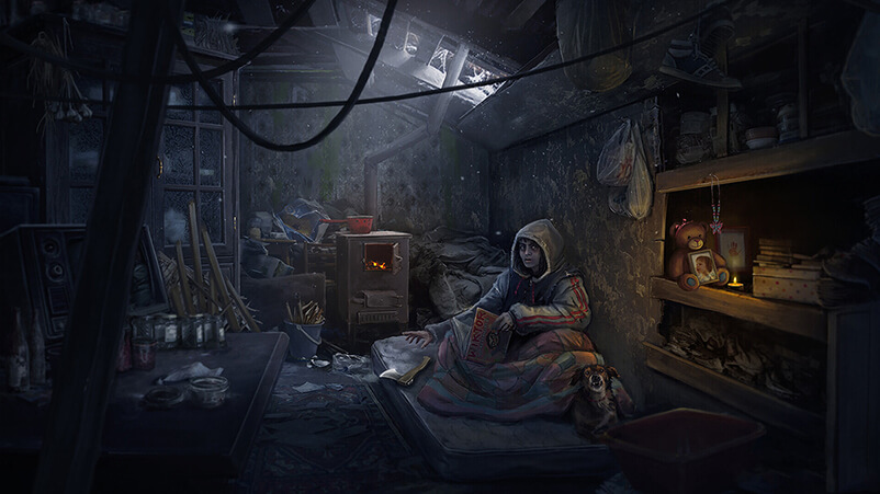
Obviously, we modified it during the development process, as we playtested certain things and had to adjust them, but I’m happy with the result we got. To answer your question, first, we build a set of rules, specify the environment, e.g. what the environment here is, what characterized by, and then we start to come up with human stories. In Dying Light games, you have abandoned flats that aren’t really human environment anymore and we have hubs, settlements and villages, which are very much still being inhabitant by humans. As a result, when we create a human-oriented environment, we normally start to think about the details, how people survive in those sets of rules that we predetermine for a given faction, how they live, what they use, what the day looks like for a given imaginary person that we decide to have there. And I personally believe this is the key when considering the humans that live in these conditions. At some point, you need to stop thinking about rules and ideas and just imagine how this guy sits here every day, he should have something to drink or maybe a book if he spends his entire day here, stuff like this. And, of course, you have to solve problems like where they sleep. In the Bazaar, for example, the construction of the church takes into account the sleeping quarters.
Guiding the Player
80.lv: How do you create the elements designed to guide players and incentivize them to go somewhere?
Katarzyna Tarnacka: There are various solutions we apply for this, not just one thing. As you’ve noticed, it does get darker on the street level, since we came up with the idea that we would like the street level to be dead. It’s a short way we can describe it. I had this idea that I would like it to feel kind of like a place under ground or under water, so that you’re not in a natural habitat, you’re not where you’re supposed to be, you’re supposed to be up. And this is where level design comes in, and it is very important.
You’re probably familiar with all the starter ramps. We’ve put a lot of effort into playtesting and inserting them just on your way, so when you’re running down the street, we don’t want you to stay on the street, our intention is to guide you up. As a result, if you’re running along the street, you’ll stumble upon a ramp that’s just going to guide you in a nice direction, somewhere you probably need to go or where we want you to go because it’s prettier or for other reasons.
We also have different color grading. When you visit the street level, the colors change, it’s not as bright, and it’s not as colorful. There are different sounds when you go down and, of course, it’s more dangerous because of the infected as well as bandits. In addition, we’ve implemented other high-level ideas for the streets versus rooftops, such as pointy, hard edges on the bottom and soft, round shapes on the top.
Making the Game Readable for Foreigners
80.lv: Do you need to do something specific in order for the game to be better readable overseas?
Katarzyna Tarnacka: I’ve found myself in a very fortunate position where we’ve built a European city, so it’s the other way around; we’re now introducing our European type of urban thinking about cities to the American audience. For us, it’s not that difficult, we just refer to what we know. Although we think about it a lot and put a great deal of work to make sure that it isn’t only for the European audience, who are different in a number of ways. They have a distinct visual library just as they have different expectations but also unique sensibility. Certain stories feel deep or interesting to us, while they might not be as compelling to audiences from other continents.
The Challenges
80.lv: When developing a game, what are the things that are the most challenging?
Katarzyna Tarnacka: It was a challenge to find balance and achieve a situation where we have buildings that actually look like buildings, they’re also climbable and we’re happy about it. It was likewise a challenge to create a game that’s compatible with all the platforms we’ve decided to release it for. That was a challenge we were thinking about throughout the entire production process. It was not always easy to make certain decisions, but you need to make them in order for your game to perform well on the various generations of machines. It can be demanding at times, but it must be done and I’m happy we’ve managed to pull it off.
Interview conducted by Kirill Tokarev.
The article was originally published on 80lv, portal on 21st of October 2022.
